
CSS-in-JS is a paradigm that allows developers to write CSS code directly in JavaScript files. Instead of having a separate CSS file for styles, the styles are encapsulated within the components themselves. This means that every component has its own unique styles, ensuring a better separation of concerns and preventing style leakage or unintended side effects.
Table of Contents
The Core Concepts of CSS-in-JS
CSS-in-JS introduces several core concepts that form the foundation of its implementation. Understanding these principles is crucial for effectively utilizing CSS-in-JS in your projects:
a. Scoped Styles
Scoped styles are a fundamental aspect of CSS-in-JS. Unlike traditional CSS, where styles are global and can unintentionally affect other components, CSS-in-JS encourages the encapsulation of styles within each component. This means that styles defined for one component will not interfere with the styles of another component, even if they have the same class names.
Example:
import React from 'react';
import { styled } from '@emotion/styled';

const Button = styled.button`
  background-color: #007bff;
  color: white;
  padding: 10px 20px;
  border: none;
  border-radius: 5px;
`;

const App = () => {
  return (
    <div>
      <Button>Click Me</Button>
      {/* Styles of the Button component won't affect other components */}
      <p>This is a paragraph.</p>
    </div>
  );
};
b. Dynamic Styling:
CSS-in-JS allows for dynamic styling, where styles can be conditionally applied based on component state or props. This dynamic nature of styling is incredibly powerful, as it enables responsive design and interactive user interfaces without the need for extensive CSS media queries or complex class toggling.
Example:
import React, { useState } from 'react';
import { styled } from '@emotion/styled';

const Button = styled.button`
  background-color: ${(props) => (props.disabled ? 'gray' : '#007bff')};
  color: white;
  padding: 10px 20px;
  border: none;
  border-radius: 5px;
  cursor: ${(props) => (props.disabled ? 'not-allowed' : 'pointer')};
`;

const App = () => {
  const [isDisabled, setIsDisabled] = useState(false);

  const handleClick = () => {
    setIsDisabled(true);
    // Simulate asynchronous operation
    setTimeout(() => setIsDisabled(false), 2000);
  };

  return (
    <div>
      <Button onClick={handleClick} disabled={isDisabled}>
        {isDisabled ? 'Processing...' : 'Click Me'}
      </Button>
    </div>
  );
};
c. Runtime Execution:
One of the interesting aspects of CSS-in-JS is that styles are often generated and injected into the document at runtime. Different libraries use varying strategies for this, but the result is that styles can be added or removed dynamically as components mount, unmount, or change state. This approach enables efficient styling updates and better performance optimizations.
d. Enhanced Reusability:
By combining CSS with JavaScript, CSS-in-JS inherently promotes better reusability of styles. Since styles are encapsulated within components, the components can be easily moved and reused across projects without worrying about external CSS dependencies. This portability significantly reduces the chances of style collisions and unintended side effects when integrating components from different sources.
Benefits and Drawbacks of Adopting CSS-in-JS Techniques
As with any technology or approach in web development, CSS-in-JS comes with its own set of benefits and drawbacks. Understanding these advantages and limitations will help you evaluate whether CSS-in-JS is the right fit for your specific project requirements:
Benefits of CSS-in-JS:
a. Scoped Styles and Encapsulation:
CSS-in-JS ensures that styles are scoped to their respective components, preventing global style pollution and class name clashes. This level of encapsulation makes it easier to reason about styles and maintain them over time, especially in large and complex codebases.
b. Dynamic Styling and Responsive Design:
The ability to use dynamic values and JavaScript logic within styles allows for responsive design implementation without the need for media queries in many cases. Components can adapt their appearance based on their state, prop values, or external conditions, leading to more flexible and interactive user interfaces.
c. Theming and Dark Mode Support:
CSS-in-JS inherently supports theming, making it easier to create and manage multiple themes for an application. Additionally, it facilitates the implementation of dark mode or light mode features with minimal effort.
d. Improved Reusability and Modularity:
By encapsulating styles within components, CSS-in-JS encourages better modularity and reusability. Components become more self-contained and can be easily shared and integrated into different projects without worrying about conflicting styles.
e. Performance Optimizations:
Certain CSS-in-JS libraries offer performance optimizations, such as the ability to eliminate unused styles during build time (dead code elimination) and extract critical CSS to improve initial page load times. This can lead to a more efficient and faster user experience.
f. Enhanced Developer Experience:
CSS-in-JS leverages JavaScript syntax, which is familiar to most front-end developers. This means that developers can use their existing knowledge and tooling to write styles, leading to a more streamlined and enjoyable development experience.
Drawbacks of CSS-in-JS:
a. Learning Curve and Tooling Overhead: CSS-in-JS may have a steeper learning curve for developers who are used to traditional CSS approaches. Moreover, adopting CSS-in-JS often requires integrating additional tooling and libraries into the project, which can increase the complexity of the development environment.
b. Performance Concerns: While some CSS-in-JS libraries offer performance optimizations, improper usage or excessive reliance on runtime styles may still lead to suboptimal performance, especially on low-powered devices. Careful consideration of performance implications is necessary when using CSS-in-JS.
c. Accessibility Challenges: Ensuring accessibility in CSS-in-JS can be challenging, particularly when dynamic styles are used. Developers need to be mindful of generating accessible markup and styles to provide an inclusive user experience.
d. JavaScript Dependence: Since CSS-in-JS relies on JavaScript for styling, users with JavaScript disabled in their browsers may experience a lack of styles or limited functionality. Progressive Enhancement strategies should be considered to address this concern.
Popular CSS-in-JS Libraries and Frameworks
As the adoption of CSS-in-JS has grown, several powerful libraries and frameworks have emerged, each offering unique approaches to implementing CSS-in-JS. Here are some of the most popular CSS-in-JS solutions that have gained significant traction in the web development community:
a. Emotion:

Emotion is a highly performant and feature-rich CSS-in-JS library that focuses on developer experience and runtime performance. It provides various styling approaches, including tagged template literals and object styles, and offers features like server-side rendering (SSR) and automatic critical CSS extraction.
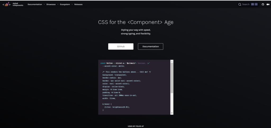
b. Styled-components:
Styled-components is a widely used CSS-in-JS library that leverages ES6 template literals to define styles. It emphasizes the concept of “styled components,” where components are defined with associated styles, making it easy to understand and manage the styles at a component level.
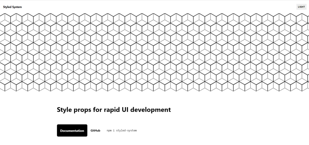
c. Styled-system:
Styled-system is a CSS-in-JS library that adopts a design system approach, allowing developers to build consistent and responsive UIs using utility-based props. It provides a set of utility functions that generate style values based on predefined scales, promoting consistency and reusability.
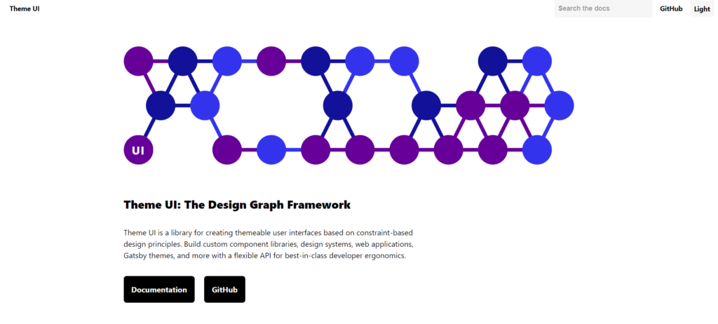
d. Theme UI:
Theme UI is a CSS-in-JS library built on top of Emotion and Styled-system. It focuses on theming and provides a simple and intuitive API to create and manage themes for applications. It encourages the use of reusable components and follows a design system methodology.
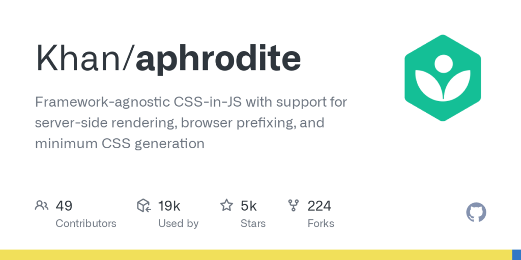
e. Aphrodite:
Aphrodite is a CSS-in-JS library developed by Khan Academy. It focuses on performance and generates unique class names for styles at runtime, reducing the size of the generated CSS. It also supports media queries and dynamic styling.
f. Radium: Radium is another performance-oriented CSS-in-JS library that offers a variety of features, including inline styles, media queries, and pseudo-selectors. It aims to provide seamless integration with existing React projects and offers additional utilities like keyframes and animations.
g. JSS (JSS + React-JSS):
JSS (JavaScript Style Sheets) is a versatile and powerful CSS-in-JS library that can be used not only with React but also with other frameworks like Vue.js and Angular. It allows developers to define styles using JavaScript objects or functions and offers server-side rendering support.
h. Linaria:
Linaria is a zero-runtime CSS-in-JS library that focuses on minimizing bundle size and runtime overhead. It extracts styles as separate CSS during the build process, resulting in a smaller bundle size compared to some other CSS-in-JS solutions.

Real-World Examples of CSS-in-JS in Action
To better understand the practical application of CSS-in-JS, let’s explore some real-world examples of how developers leverage this approach to solve styling challenges and create dynamic user interfaces:
Example 1: Responsive Navigation Bar
A common use case for CSS-in-JS is creating responsive navigation bars. By using dynamic styling, developers can adjust the appearance of the navigation bar based on the screen size or other factors. This allows for a smooth transition between different layouts, ensuring optimal user experience across various devices.
import React from 'react';
import { styled } from '@emotion/styled';

const NavBar = styled.nav`
  display: flex;
  justify-content: space-between;
  align-items: center;
  padding: 1rem;

  @media (max-width: 768px) {
    flex-direction: column;
    align-items: flex-start;
    background-color: #007bff;
    color: white;
    padding: 1rem 2rem;
  }
`;

const Logo = styled.a`
  font-size: 1.5rem;
  text-decoration: none;
  color: #333;
`;

const NavItems = styled.ul`
  display: flex;
  list-style: none;

  @media (max-width: 768px) {
    flex-direction: column;
    align-items: flex-start;
  }
`;

const NavItem = styled.li`
  margin: 0 1rem;

  @media (max-width: 768px) {
    margin: 0.5rem 0;
  }
`;

const App = () => {
  return (
    <NavBar>
      <Logo href="/">My Website</Logo>
      <NavItems>
        <NavItem>Home</NavItem>
        <NavItem>About</NavItem>
        <NavItem>Contact</NavItem>
      </NavItems>
    </NavBar>
  );
};
Example 2: Theming in a Design System
CSS-in-JS makes theming in a design system more manageable. Developers can create a theme object containing colors, fonts, and other design tokens, and then apply the theme to various components in the system. This ensures consistent branding and allows for easy customization of the UI across different applications.
import React from 'react';
import { ThemeProvider, css } from '@emotion/react';

const theme = {
  colors: {
    primary: '#007bff',
    secondary: '#6c757d',
    error: '#dc3545',
  },
  fonts: {
    body: 'Helvetica, Arial, sans-serif',
    heading: 'Roboto, sans-serif',
  },
};

const Button = styled.button`
  background-color: ${(props) => props.theme.colors.primary};
  color: white;
  padding: 10px 20px;
  border: none;
  border-radius: 5px;
  font-family: ${(props) => props.theme.fonts.heading};
`;

const App = () => {
  return (
    <ThemeProvider theme={theme}>
      <Button>Click Me</Button>
    </ThemeProvider>
  );
};
Example 3: Dark Mode Toggle
CSS-in-JS can enable dynamic styles, making it perfect for implementing a dark mode toggle in an application. By using state or context to determine the current mode, developers can adjust the styles accordingly to create a seamless dark mode experience for users.
import React, { useState } from 'react';
import { styled } from '@emotion/styled';

const AppContainer = styled.div`
  background-color: ${(props) =>
    props.isDarkMode ? '#1a1a1a' : 'transparent'};
  color: ${(props) => (props.isDarkMode ? 'white' : 'black')};
`;

const DarkModeToggle = styled.button`
  background-color: ${(props) => (props.isDarkMode ? '#333' : '#f0f0f0')};
  color: ${(props) => (props.isDarkMode ? 'white' : 'black')};
  padding: 5px 10px;
  border: none;
  border-radius: 5px;
`;

const App = () => {
  const [isDarkMode, setIsDarkMode] = useState(false);

  const handleDarkModeToggle = () => {
    setIsDarkMode((prevMode) => !prevMode);
  };

  return (
    <AppContainer isDarkMode={isDarkMode}>
      <h1>Hello, World!</h1>
      <DarkModeToggle onClick={handleDarkModeToggle}>
        {isDarkMode ? 'Light Mode' : 'Dark Mode'}
      </DarkModeToggle>
    </AppContainer>
  );
};
These examples illustrate how CSS-in-JS enables developers to create dynamic and responsive user interfaces, implement theming, and introduce interactive features effortlessly. The ability to combine CSS and JavaScript within a single codebase empowers developers to write more maintainable, reusable, and flexible styles, ultimately leading to a better user experience.
Conclusion
In conclusion, CSS-in-JS has already established itself as a valuable approach to managing styles in modern web development. As it continues to evolve, we can expect more performance optimizations, better developer experiences, and innovations that further empower developers to create compelling and dynamic user interfaces. Staying up-to-date with the latest developments in the CSS-in-JS space will ensure that you can leverage the most effective and efficient techniques for your projects.